This work is an investigative study on Brazilian vernacular Design, based on circular and hybrid relations between the language of vernacular design and formal graphic design. In this context, the fields of production of popular Design and institutionalized Design can merge, resulting in productions that combine aspects of both groups. This causes displacement and re-signification of vernacular art, which can be considered a sort of “appropriation”.
The project materializes in an exhibition called Cultura Viva (Living Culture) that addresses the subject of circulation of vernacular production in Brazil and its occurrence in the field of commercial Design.
The exhibition is divided into three central axes: the diversity of vernacular manifestations in the field of typography; the methods of production by vernacular artists; and the representation of these manifestations in mass culture and, therefore, in the field of Design. The purpose of the project is to value the various manifestations of vernacular production. It is also due to present their representations in Brazilian graphic Design and invite the public for a dialogue about the importance of ethics in the appropriation theme. In this way, the exposure creates a hybrid environment, promoting user immersion and stimulating the debate, without delivering value judgments.
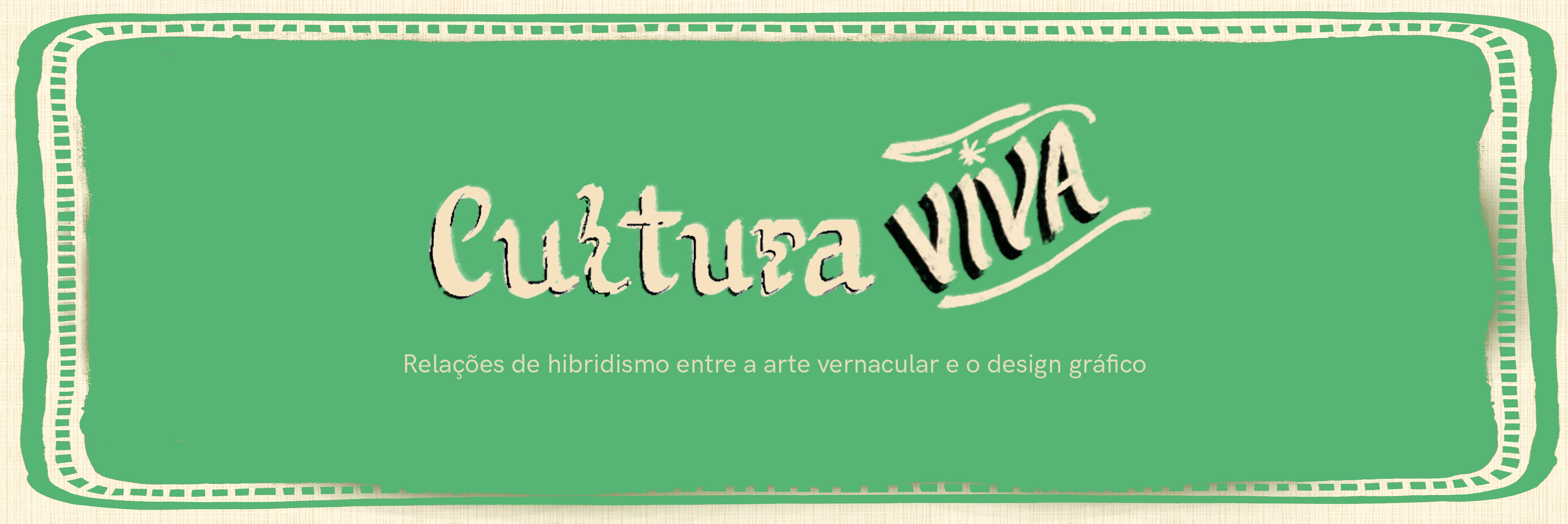
Cultura Viva
Living Culture
Exhibition Design
2021
Concept _ Viviane Martins
Counseling_ Izabel Oliveira e Luiz Ludwig


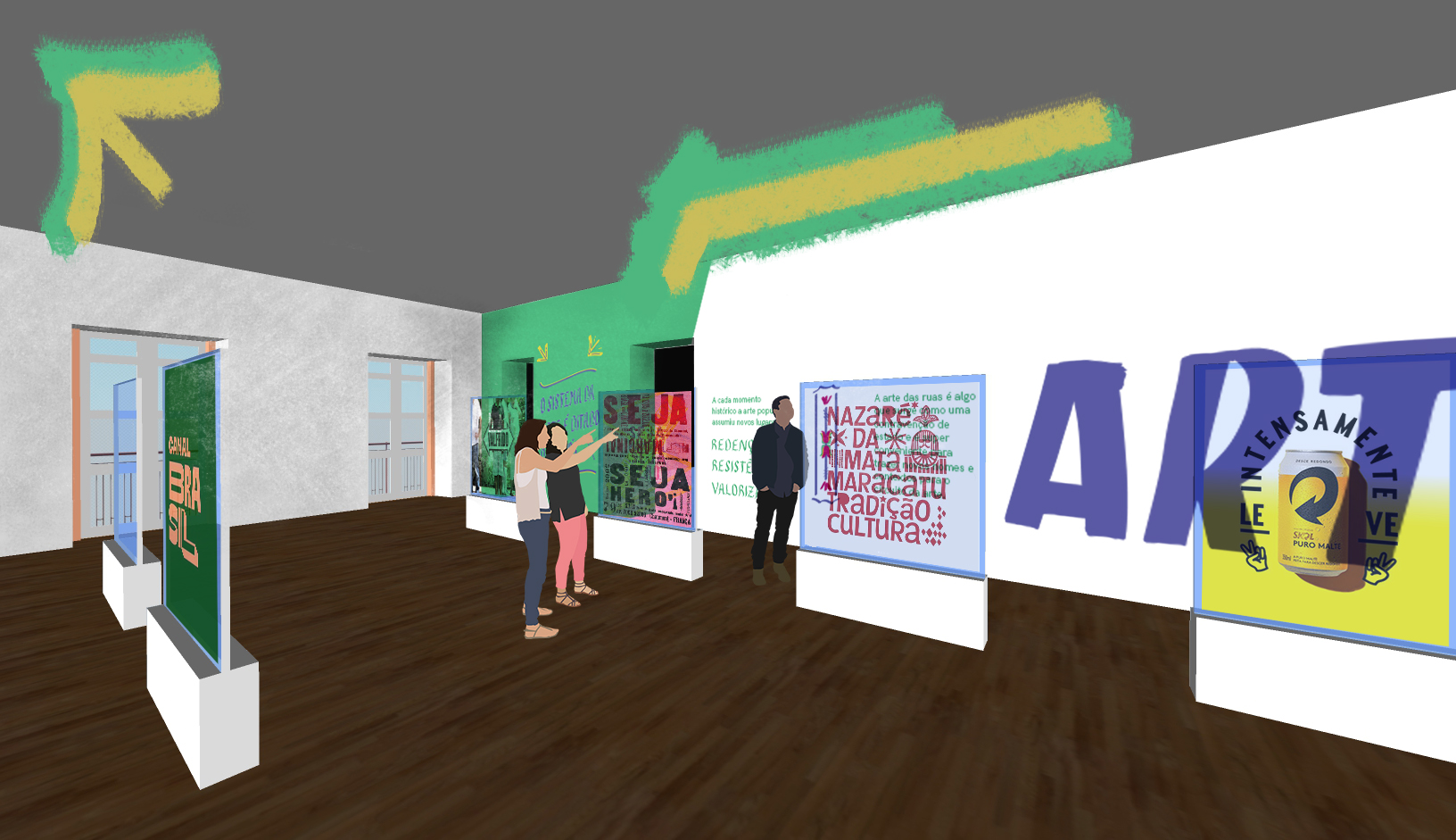
3d art of the exhibition rooms.
Curated choice and the development of the exhibition Design are the focus points of the project. The curatorship involves not only selecting art pieces, but also inviting artists to co-create the exhibition environment.

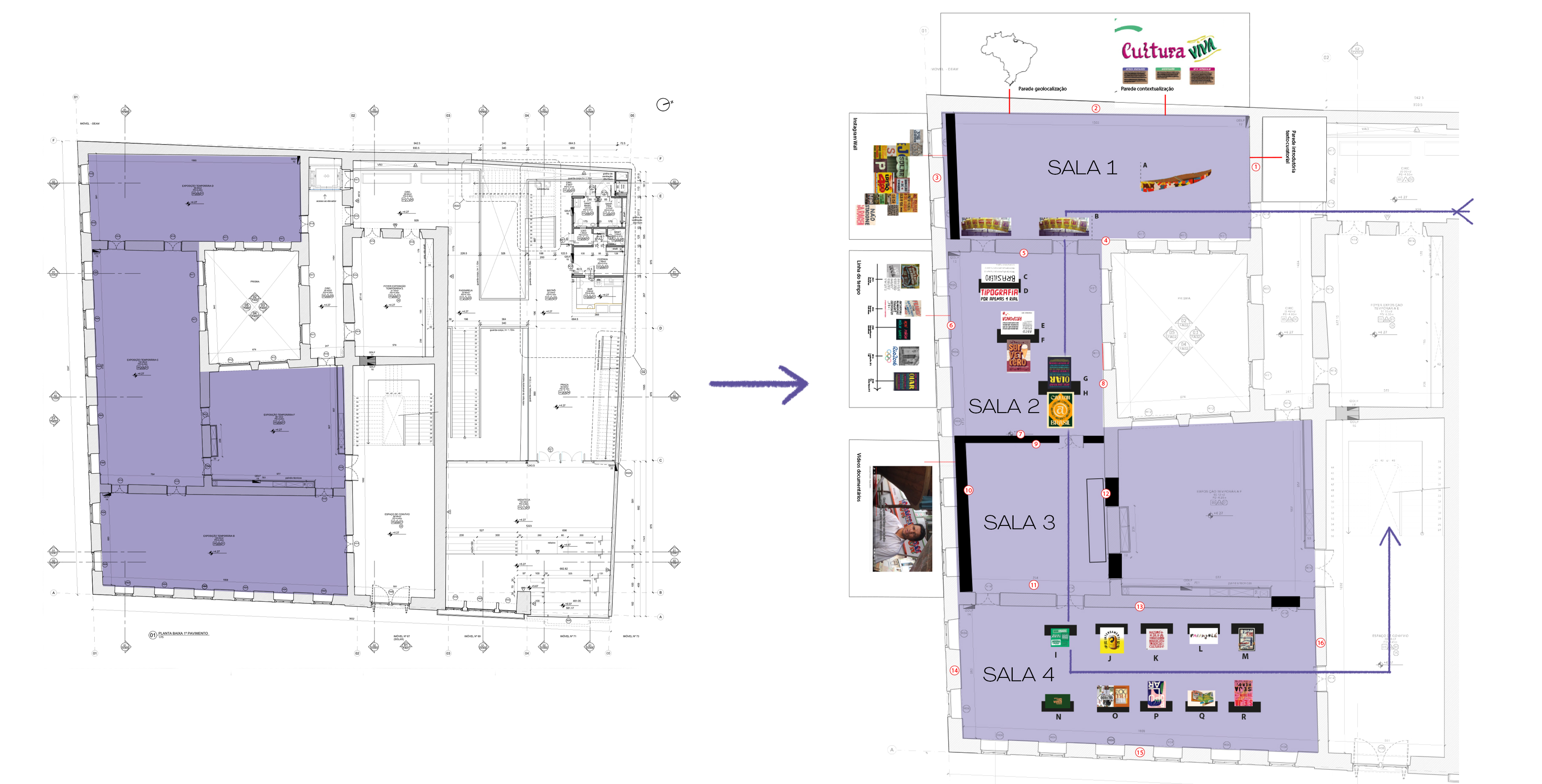
Plan of the exhibition space at the CRAB museum — SEBRAE Reference Center for Brazilian Crafts and the arrangement of rooms referring to the space.
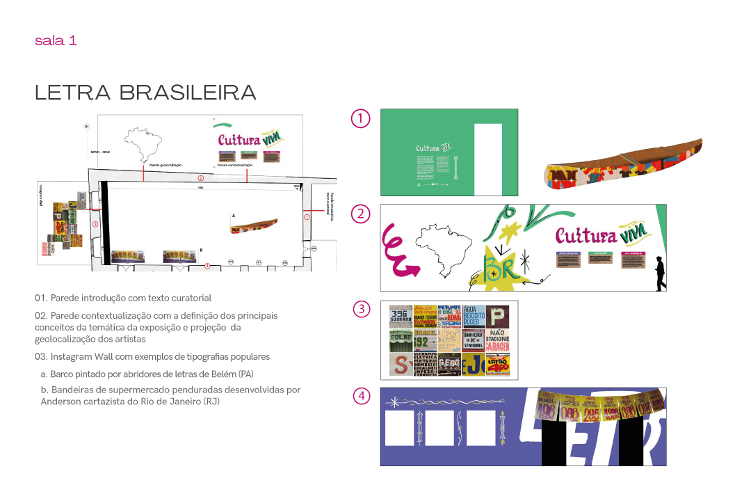
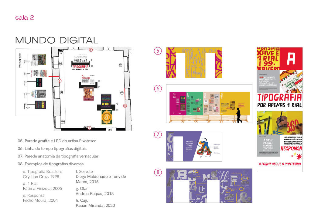


Content of each room.
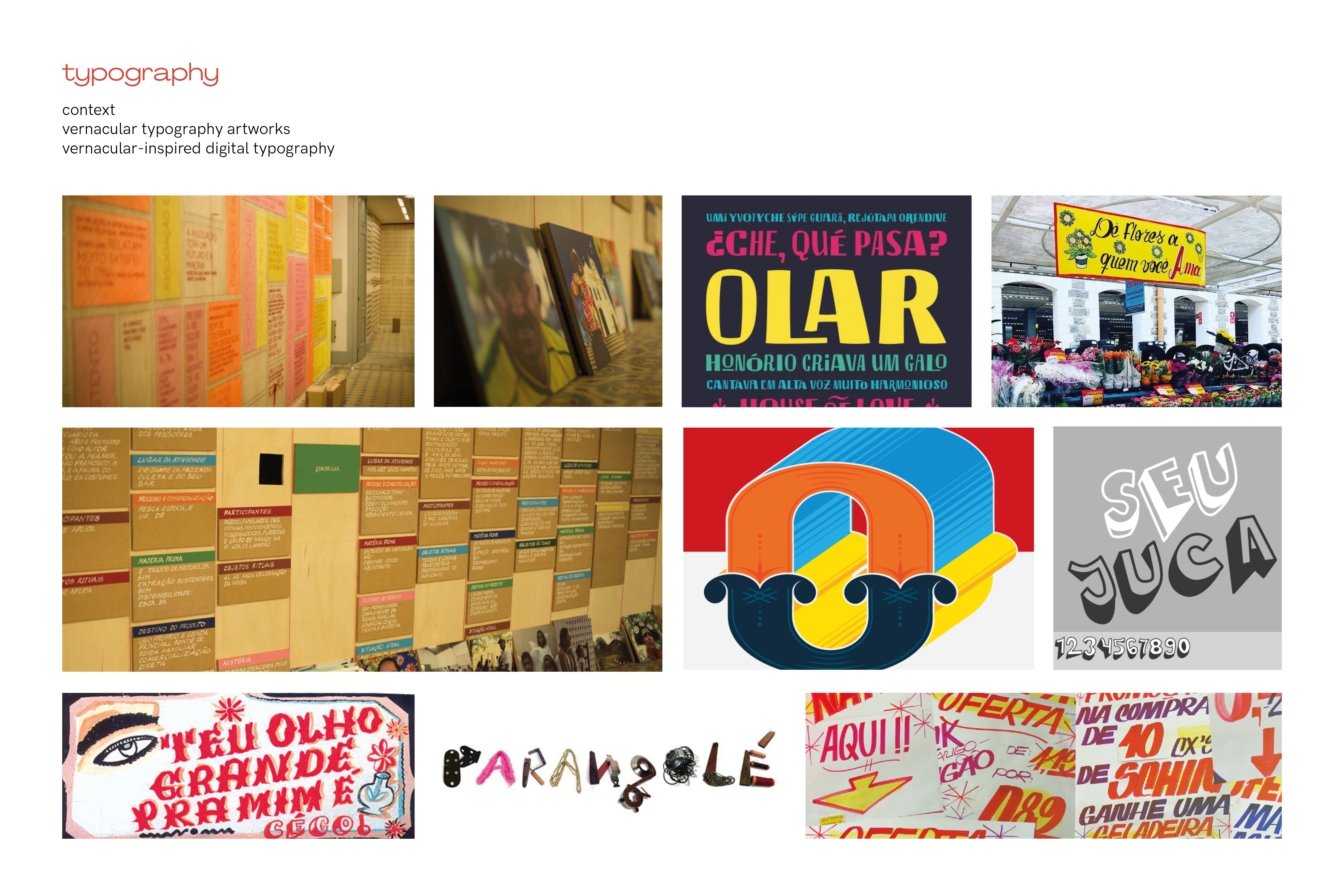
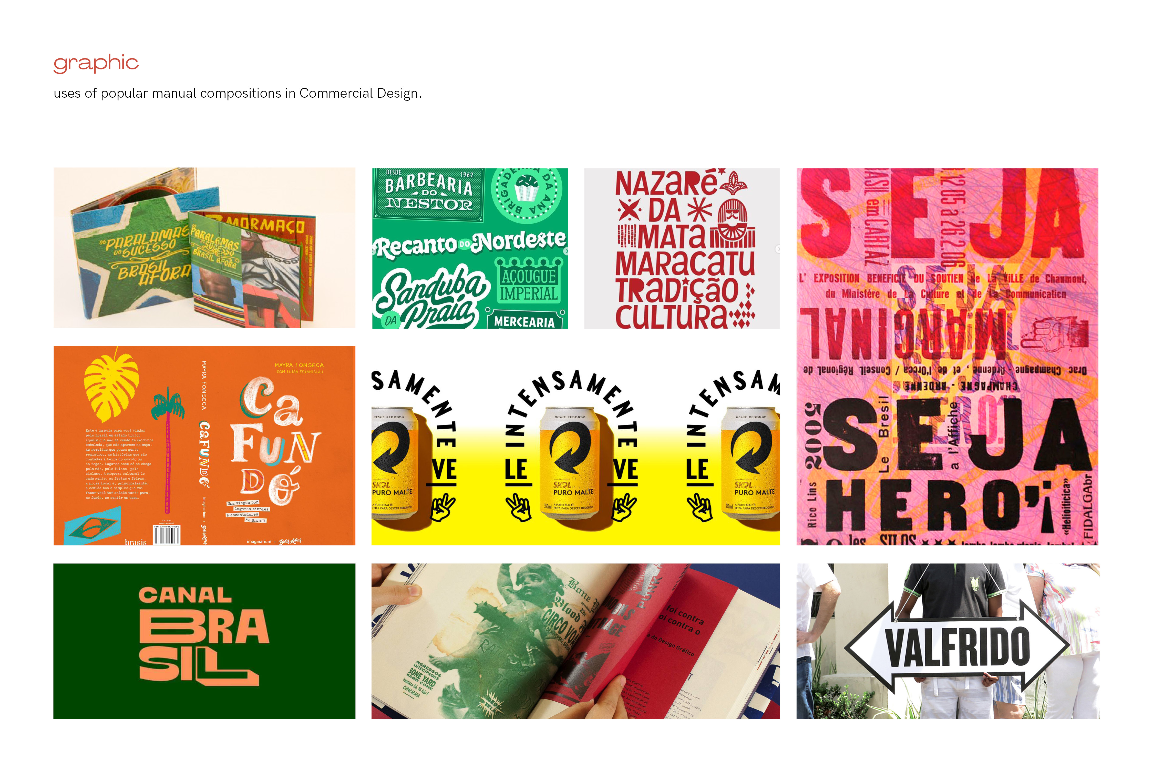
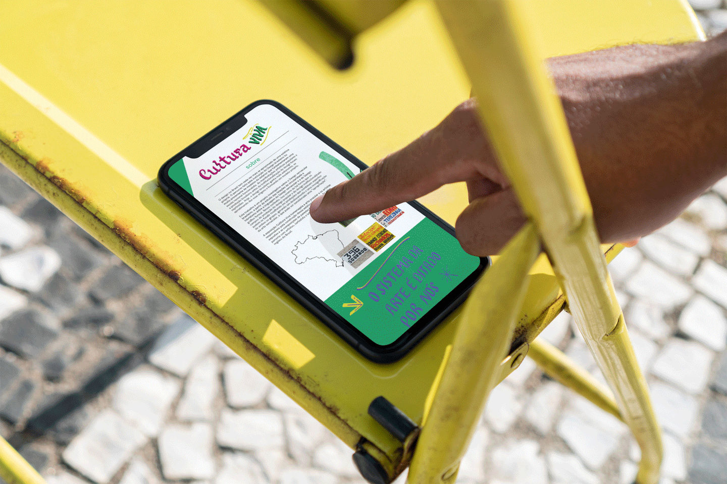
Cultura Viva’s visual identity was born with the development of wall art layouts that fill the exhibition. It was very inspired by popular art projects found in the curatorial studies. It involves the use of calligraphic typography, saturated colors and brush textures that refer to manual production. In addition, the identity contains pictorial forms widely used in typography popular, as supporting graphic elements, such as arrows, asterisks, and frames.


Examples of visual identity application on the exhibition's infographic walls.


Simulation of graphic and digital material for the development of publicity pieces.