Spartacus is a complementary course to basic education in the neighborhood of Madureira in Rio de Janeiro. The course is based on the theory of 9 intelligences for all its activities and aims at valuing the individual. Spartacus wants to be a place of transformation and welcoming for young people in the North Zone of Rio.
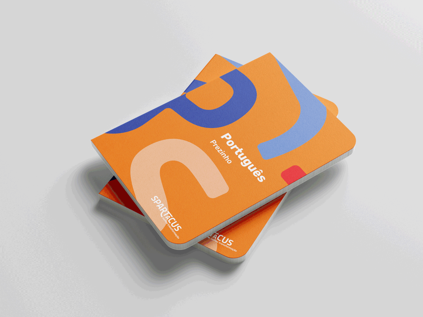
The visual identity represents this joint construction: the individual as a fundamental piece for the creation of a collective in which differences form the whole.
The visual identity represents this joint construction: the individual as a fundamental piece for the creation of a collective in which differences form the whole.
Spartacus
Branding
2019
Created at Empresa Júnior PUC-Rio
Team _ Viviane Martins and Florencia Tomé
Team manager _ Sofia Tomé

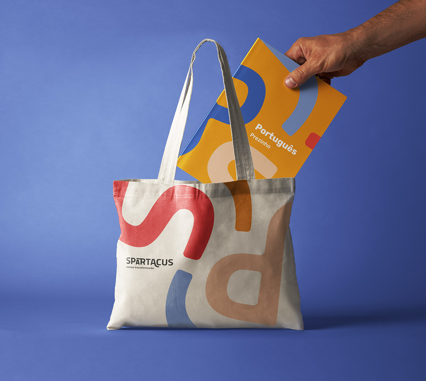
Since Spartacus needs to communicate with diverse audiences
— children, teenagers, guardians, companies
—
the visual identity needs to adapt to different contexts.
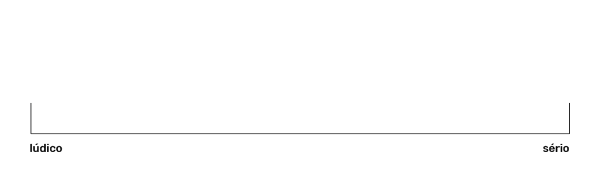
The gradual strip was used as a methodology for the client to identify how to continue the visual communication of the project. The graphics can be applied in a more playful way, with more curved shapes; or in a more serious, with straighter shapes.
The gradual strip was used as a methodology for the client to identify how to continue the visual communication of the project. The graphics can be applied in a more playful way, with more curved shapes; or in a more serious, with straighter shapes.